15 Best White Paints for 2023
PART 2
15 Best White Paints for 2023
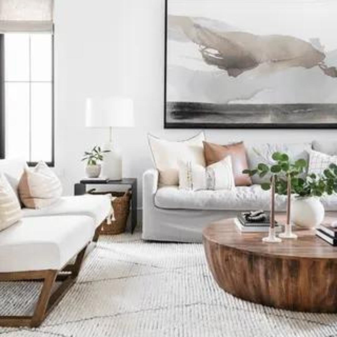
Choosing the ideal color story for any room already feels like a daunting task but trying to pick the best white paint color for your home feels downright impossible. The arguably nuanced color remains an indispensable decorating tool for its versatility. Whether it be used as a warm backdrop in a serene bedroom, lacquered onto the ceiling for a glamorous effect, or deployed as a crisp trim color, the possibilities are endless.

However, one can’t help but beg the question: How can one color have so many shades and variations? It’s never just white—it’s off-white, eggshell—the list goes on and on. Lucky for you, I have already done the legwork and compiled a small list of my most reliable go-to whites. Decorator’s White, by Benjamin Moore, is a cool white, and has a little blueish/purple and a little gray. As we learned in Part 1, cool whites work best in a South facing room, which will receive lots of natural light, to cancel out the blues (assuming you aren’t going for a blue paint color). If you use this color in a North facing room, you’ll amplify the blue.

Another cool white is Benjamin Moore’s White Heron. Make sure you’re thinking of your artificial light sources in relation to the undertones of your white paint as well; Lower Kelvins means warmer; higher Kelvins will you give you a cooler glow from your bulbs. For more cool whites, check out Benjamin Moore’s Paper White (gray, modern, sophisticated), Strong White and Blackened, both by Farrow & Ball and Ethereal White by Sherwin Williams. Any room with strong natural light is a good candidate for these cool whites.

A few warm whites to check out from Benjamin Moore are Alabaster (think soft) and Swiss Coffee (think golden and creamy); both would be good choices for a North facing room (North facing light reads gray) Another BM option is Acadia White – no yellow or pink undertones here, just calm and sophistication. Warm whites also complement wood tones in a room.
On the Sherwin Williams side, we have White Flour (the slightest hint of brown) and Sanctuary (think calm, soothing, relaxing). For the ultimate in Zen, think Sanctuary + plants + Boho vibe. For Farrow & Ball fans, Wimborne White has a faint whiff of yellow to soften it, but none of the cool blue undertones. A popular white that somehow comes in as both warm and cool is Benjamin Moore’s White Dove. It gives off a bit of a green hue with gray undertones and is used often for painting trim and moldings. White Dove doesn’t have a yellow effect – just use it in a room with plenty of natural light. It reads soft, but bright, so it’s great for pairing with dark colors like grays and blacks – the contrast gives the room a great energy.

Benjamin Moore offers another very versatile option that straddles the line between warm and cool, and that’s Simply White. This well-balanced white can be used anywhere from ceilings to walls to trim. On the Sherwin Williams side, try Greek Villa – warm but balanced with a blue undertone and Farrow & Ball offers Cornforth White – with white, light gray and even lavender in play here, this white isn’t too cool or too warm.
My advice is to purchase paint samples and look at them on your wall throughout the day. The crazy thing about white is that green plants outside your window, your flooring type, drapery in the room, furniture in the room, etc.. will all play with light and your paint finish and color choice to change how your eye reads the color on the wall. So, if you really need a sure thing, the best way to do that is to live with it on the wall in sample form for a few days. And don’t put the samples next to one another! If you’re sampling 3 different whites, place them apart from each other.

And what about which paint finish to select?
Flat/matte is becoming a more popular choice for walls (it used to be standard only on ceilings). It has a velvety finish and reflects almost no light, which means it isn’t known for highlighting imperfections. Flat paint has a bad rep for showing stains and being more delicate to clean, but today, a high grade flat finish is washable too.
Eggshell/Satin finishes have a little shine to them. They’re durable, wipeable, making them great choices for kitchens (even cabinets) and baths.
Semi-Gloss is generally used for trim. More shine equals more durability, but also more light reflection, something to keep in mind because it will highlight imperfections.
High Gloss is becoming more and more popular (yay!), especially with bold blues and greens. Some people like to paint ceilings high gloss, and it’s a fun option for the undersides of open doorways and for doors. It’s always fun to step up the sheen from surface to surface – shinier trim than walls, shinier ceiling than trim, etc.
Look, here’s my take on finishes – walls have imperfections. Who cares? To whoever needs to hear this: I give you permission to choose your paint finish based on anything and everything (wipe ability, looks, impact, etc.) EXCEPT concern about imperfections. Spaces are meant to be lived in, walls and doors and floors and trim may all get dinged up over the coming months and years – guess what? That’s life, and it will be a reason for future you to try a new color! So now that the hard work is done, try one of these reliable whites for a refreshing take on the classic. You'll be amazed by how it transforms any room.

Lori Shaw